Cabell’s Rebrand
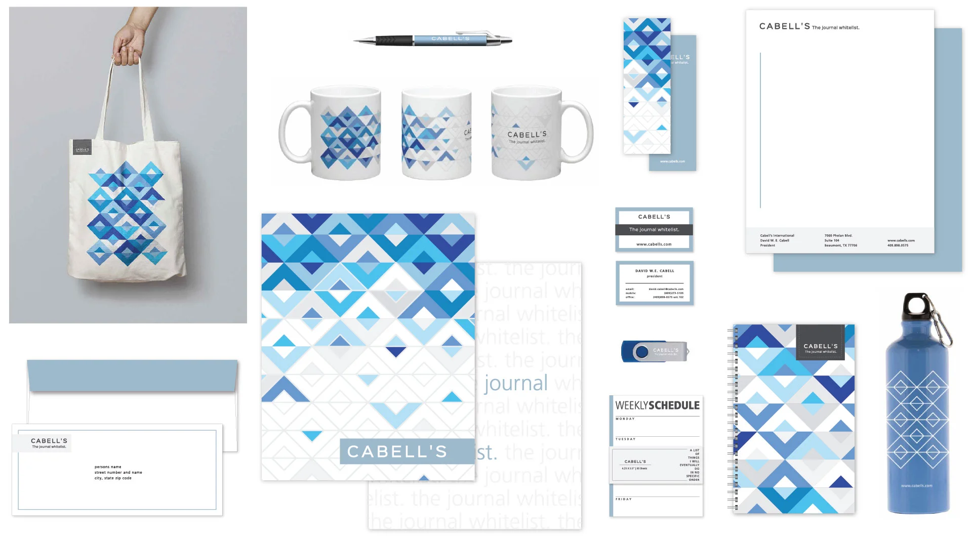
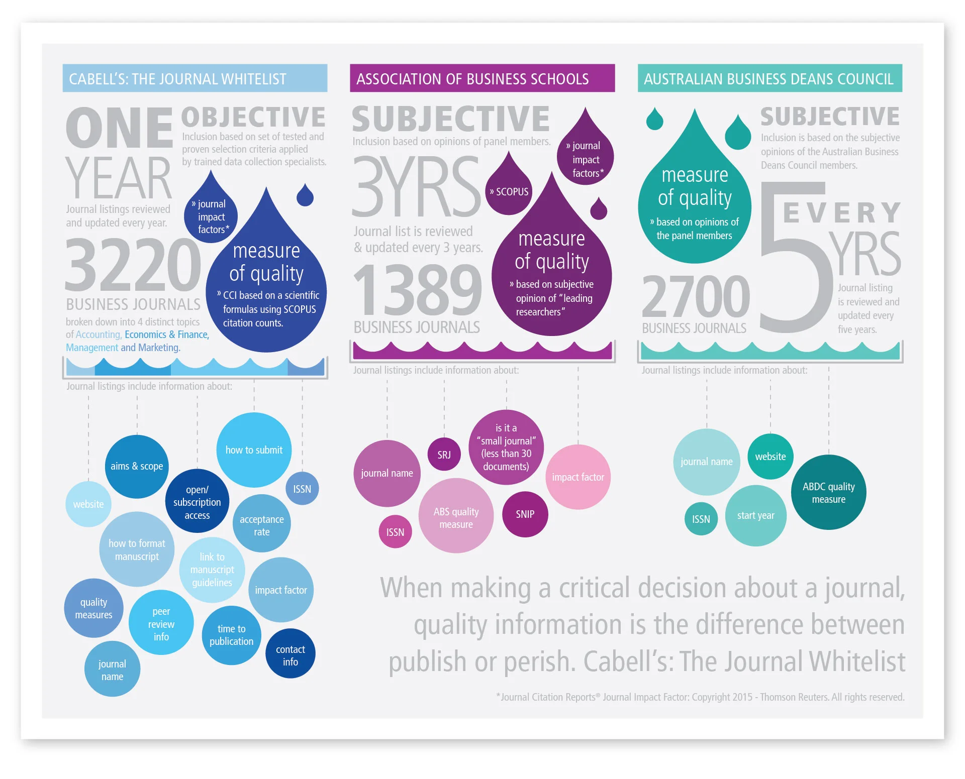
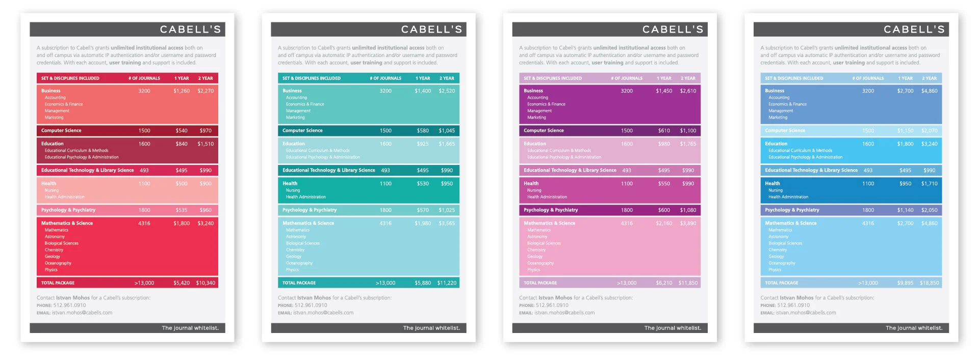
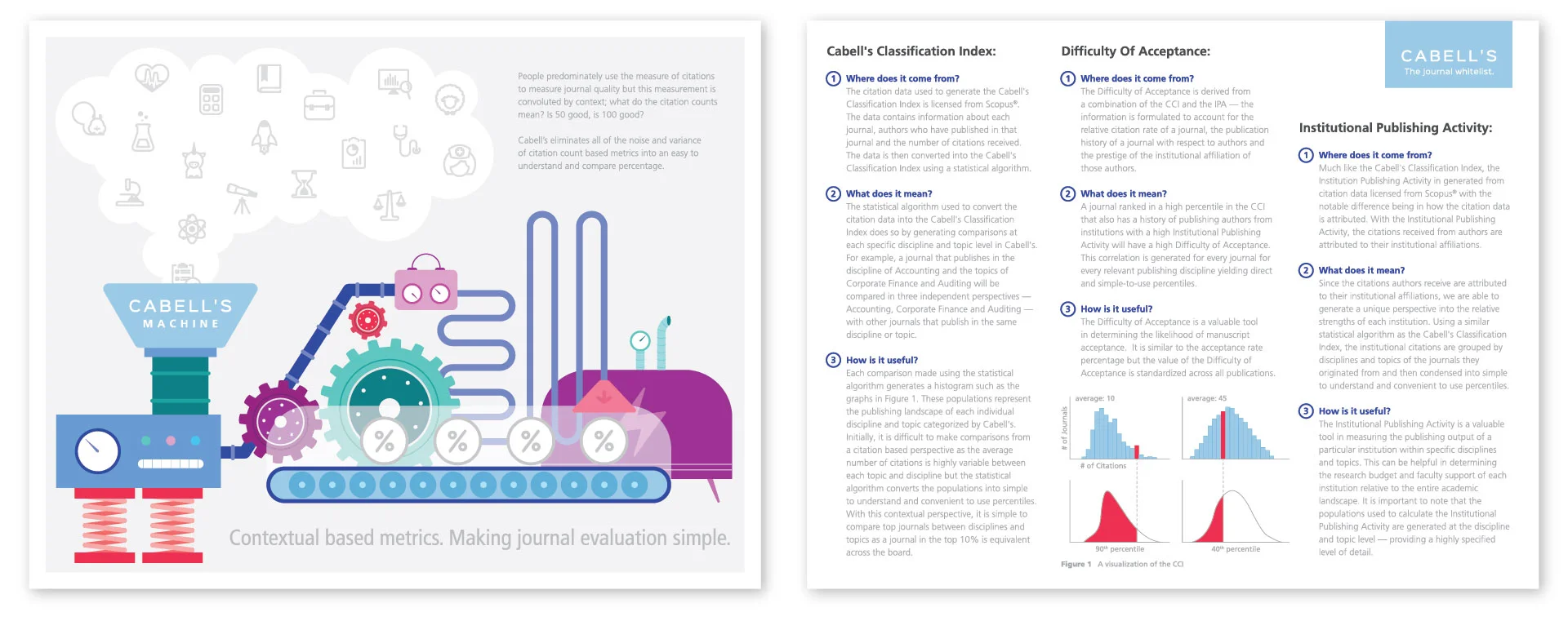
Cabell’s old brand identity featured monochromatic design with accents of a desaturated blue. The new design built on these key elements, featuring a more robust color palette to create a clean, bright look with pops of color. A custom icon set and fun pattern were also developed and used across internal and external collateral. A subset of the brand takes the opposite approach, showcasing a dark backdrop, playing off the obvious connotations of ‘whitelist’ and ‘blacklist’.


